 打赏
打赏
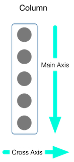
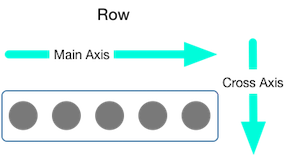
一、线性布局:Row Column
Row 在水平方向上排列部件
Column 在垂直方向上排列部件
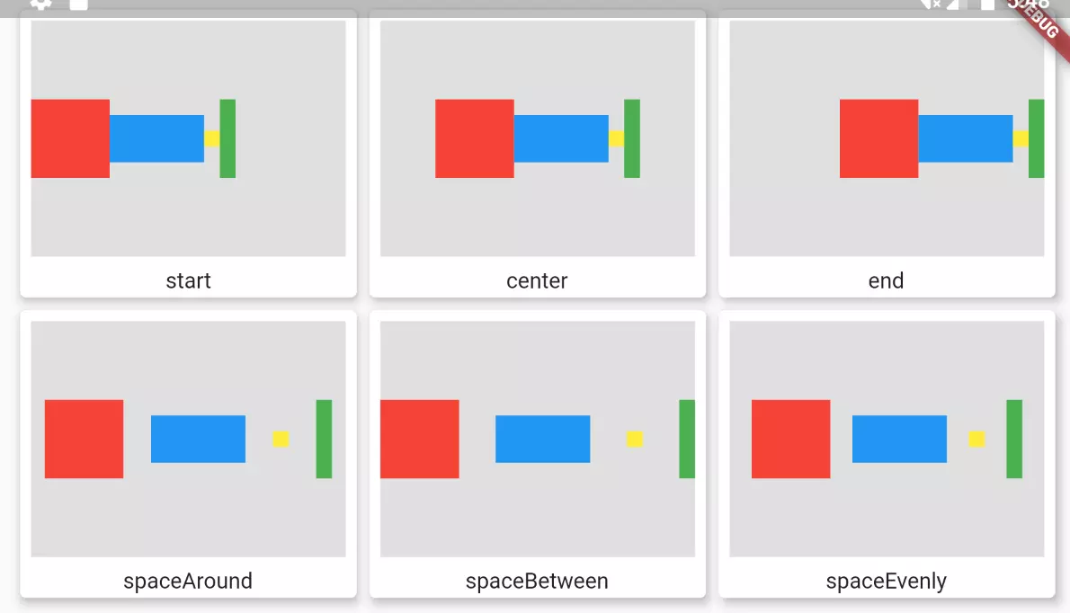
二、弹性布局:Flex
沿着水平或垂直方向排列部件,与Expanded配合使用。
三、流式布局:Warp Flow
在水平或垂直方向显示多行,可以自动换行
Flow可以自定义实现流式布局算法的部件
class MyButton extends StatelessWidget {
final String title;
const MyButton(this.title, {Key? key}) : super(key: key);
@override
Widget build(BuildContext context) {
return ElevatedButton(
onPressed: () {},
style: ButtonStyle(
textStyle: MaterialStateProperty.all(const TextStyle(fontSize: 20)), //字体大小
foregroundColor: MaterialStateProperty.all(Colors.white), //字体颜色
backgroundColor: MaterialStateProperty.all(Colors.blue), //背景颜色
side: MaterialStateProperty.all(const BorderSide(width: 1, color: Colors.green)), //边框
shadowColor: MaterialStateProperty.all(Colors.black), // 阴影颜色
elevation: MaterialStateProperty.all(0), //阴影值
shape: MaterialStateProperty.all(BeveledRectangleBorder(borderRadius: BorderRadius.circular(3))), //圆角弧度
),
child: Text(title),
);
}
}
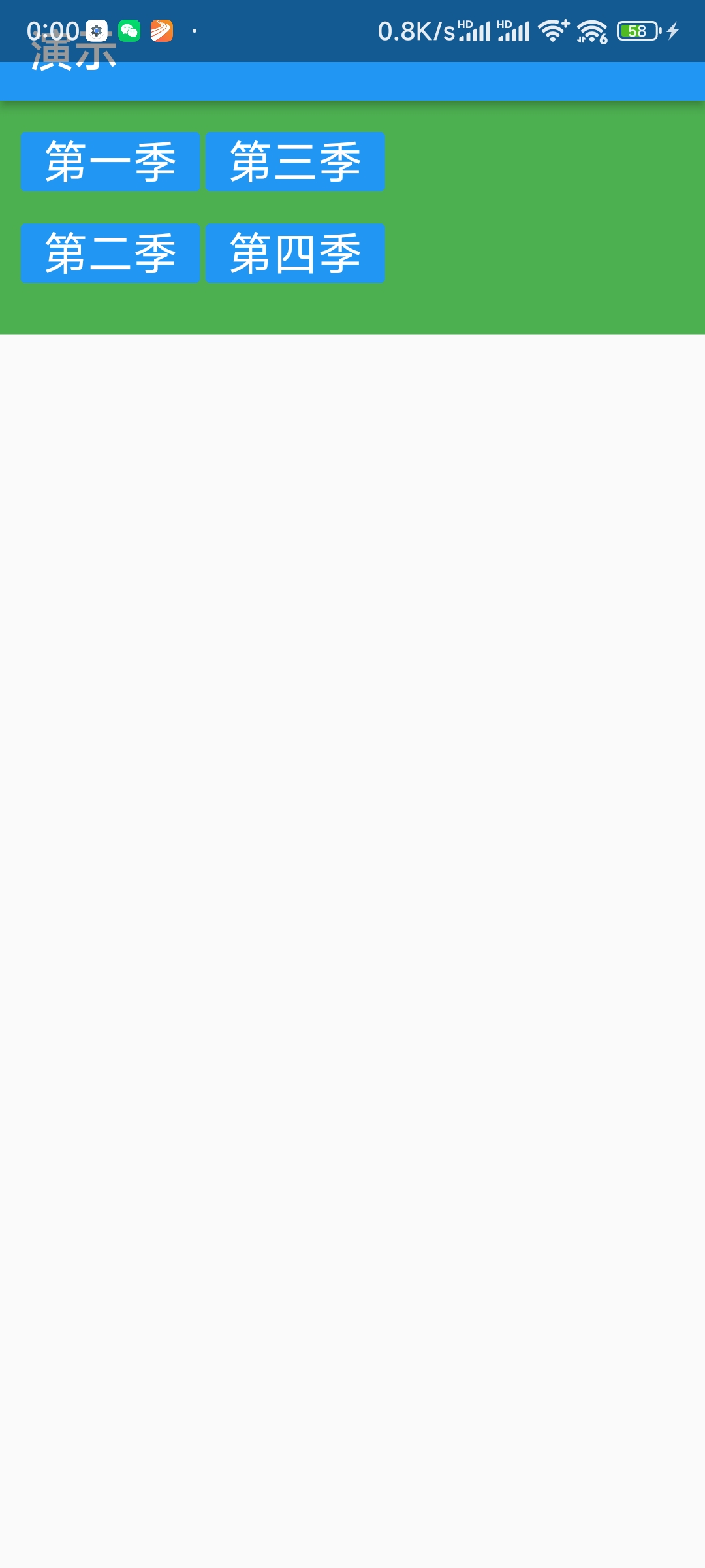
class HomeContent extends StatelessWidget {
const HomeContent({Key? key}) : super(key: key);
@override
Widget build(BuildContext context) {
return Container(
width: 700,
height: 130,
color: Colors.green,
padding: const EdgeInsets.all(10),
child: Wrap(
direction: Axis.vertical,
spacing: 3,
runSpacing: 0,
runAlignment: WrapAlignment.start,
children: const <Widget>[
MyButton('第一季'),
MyButton('第二季'),
MyButton('第三季'),
MyButton('第四季'),
],
));
}
}
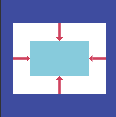
四、层叠布局/绝对布局:Stack Positioned
可以允许子部件简单的堆叠在一起。与Positioned配合设置坐标。 可以类比Web中的absolute绝对布局。
  Widget build(BuildContext context) {
    return Center(  // 外套,让层叠布局的内容剧中
        child: Stack( // 层叠布局
      alignment: Alignment.center, // 层叠布局的内容居中
      children: <Widget>[
        Container(  // 一个容器
          height: 400,
          width: 300,
          color: Colors.red,
        ),
        const Text(  // 一个文本
          '我是一个文本',
          style: TextStyle(color: Colors.white, fontSize: 30),  // 文本的样式
        ),
      ],
    ));
  }
}
  Widget build(BuildContext context) {
    return Center(
        child: Stack(
      alignment: Alignment.center,
      children: const <Widget>[
        Positioned(
          left: 10,
          top: 10,
          child: Icon(Icons.abc, color: Colors.green, size: 30),
        ),
        Positioned(
          left: 40,
          top: 10,
          child: Icon(Icons.home, color: Colors.red, size: 30),
        ),
        Positioned(
          right: 10,
          top: 20,
          child: Icon(Icons.search, size: 30),
        ),
      ],
    ));
  }
五、常用布局组件
Center
将其子部件居中显示
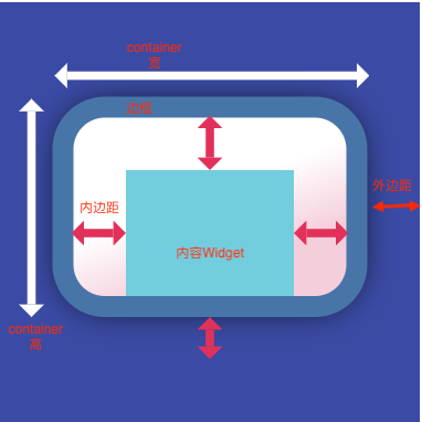
Container
约束布局,拥有绘制、定位、调整大小的部件
GridView
将部件排列为可滚动的网络
GridView.count 允许指定列数
GridView.extent 允许指定项的最大像素宽度
ListView
将部件排列为可滚动的列表
Card
将相关内容放到带圆角和投影的盒子中
  Widget build(BuildContext context) {
    return ListView(
      children: [
        Card(
          shadowColor: Colors.black,
          elevation: 6.0,
          margin: const EdgeInsets.all(5),
          child: Column(
            children: const [
              ListTile(
                title: Text(
                  "张三",
                  style: TextStyle(fontSize: 20),
                ),
                subtitle: Text("高级工程师"),
              ),
              ListTile(
                title: Text("电话:181113133443"),
              ),
              ListTile(
                title: Text("地址: 四川成都双流"),
              )
            ],
          ),
        ),
        Card(
          shadowColor: Colors.black,
          elevation: 6.0,
          margin: const EdgeInsets.all(5),
          child: Column(
            children: const [
              ListTile(
                title: Text(
                  "李四",
                  style: TextStyle(fontSize: 20),
                ),
                subtitle: Text("中级工程师"),
              ),
              ListTile(
                title: Text("电话:183546789041"),
              ),
              ListTile(
                title: Text("地址: 四川成都温江"),
              )
            ],
          ),
        ),
      ],
    );
  }
  Widget build(BuildContext context) {
    return ListView(
      children: [
        Card(
          margin: const EdgeInsets.all(10),
          child: Column(
            children: [
              AspectRatio(
                aspectRatio: 16 / 9,
                child: Image.network("https://www.itying.com/images/flutter/1.png", fit: BoxFit.cover),
              ),
              ListTile(
                title: const Text("....."),
                subtitle: const Text("...."),
                leading:
                    ClipOval(child: Image.network("https://www.itying.com/images/flutter/1.png", fit: BoxFit.cover, height: 60, width: 60)),
              )
            ],
          ),
        ),
        Card(
          margin: const EdgeInsets.all(10),
          child: Column(
            children: [
              AspectRatio(
                aspectRatio: 16 / 9,
                child: Image.network("https://www.itying.com/images/flutter/2.png", fit: BoxFit.cover),
              ),
              const ListTile(
                title: Text("....."),
                subtitle: Text("...."),
                leading: CircleAvatar(
                  backgroundImage: NetworkImage("https://www.itying.com/images/flutter/2.png"),
                  radius: 30,
                ),
              )
            ],
          ),
        ),
      ],
    );
  }
类似于上面的效果,通过调用动态数据来实现。其中listData在另一个文件中定义为数组
List listData = [
  {
    "title": 'Candy Shop',
    "author": 'Mohamed Chahin',
    "imageUrl": "https://www.itying.com/images/flutter/1.png",
  },
  ...
]
  Widget build(BuildContext context) {
    return ListView(
      children: listData.map((v) {
        return Card(
          margin: const EdgeInsets.all(10),
          child: Column(
            children: [
              AspectRatio(
                aspectRatio: 16 / 9,
                child: Image.network(v["imageUrl"], fit: BoxFit.cover),
              ),
              ListTile(
                title: Text(v["title"]),
                subtitle: Text(v["author"]),
                leading: CircleAvatar(
                  backgroundImage: NetworkImage(v["imageUrl"]),
                  radius: 30,
                ),
              )
            ],
          ),
        );
      }).toList(),
    );
  }
ListTile
将最多3行文字,以及可选的行前和行尾的图标排成一行
滚动布局
SingleChildScrollView 可以在垂直或水平方向滚动,只包含一个子组件
AspectRation 布局比例
  Widget build(BuildContext context) {
    return AspectRatio(
      aspectRatio: 3.0 / 1.0,  // 定义组件的长宽比
      child: Container(
        color: Colors.red,
      ),
    );
  }
六、其它
Expanded
可以使Row、Column、Flex等子组件在其主轴上方向展开并填充可用的空间。
ConstrainedBox
ConstrainedBox用于对子组件添加额外的约束;
  Widget build(BuildContext context) {
    return MaterialApp(
      title: '盒约束模型',
      home: Scaffold(
        appBar: AppBar(title: Text('盒约束模型--ConstrainedBox')),
        body: ConstrainedBox(
            constraints: BoxConstraints(
              minWidth: 50,
              maxWidth: 100,
              minHeight: 50,
              maxHeight: 100
            ),
            child: Container(
              width: 80,
              height: 5,
              child: DecoratedBox(
                decoration: BoxDecoration(
                  color: Colors.red
                )
              )
            )
         )
      )
    );
  }
BoxConstraints
BoxConstraints 是盒模型布局过程中父渲染对象传递给子渲染对象的约束信息,包含最大宽高信息,子组件大小需要在约束的范围内
控制样式 DecoratedBox
可以在其子组件绘制前/后绘制一些装饰
SizedBox
直接用SizeBox给子元素指定固定的宽高
Align
只能有一个子控件,可以随意调整子控件的所在位置
ClipOval
将布局裁剪成圆形
PhysicalModel
主要的功能就是设置widget四边圆角,可以设置阴影颜色,和z轴高度
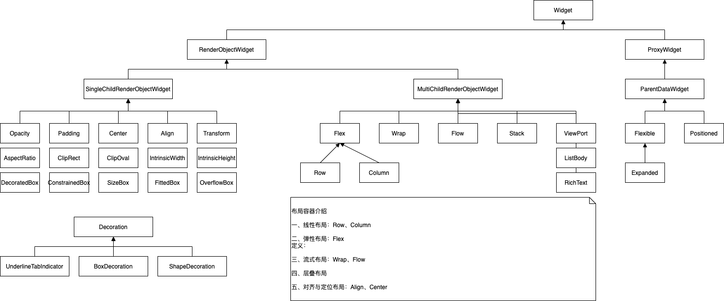
布局组件类图